by Airan Wright
(Originally published August 21, 2018 at Magenic Technologies)
The everyday lives of everyday people start with everyday movement. We turn a knob on the faucet. We flip on the light switch. We slide open a silverware drawer. We progress through our day manipulating objects in functional ways to produce predictable results. Given this fact, it should come as no surprise that approaching similar functionality within a digital space will help build a level of comfort for your user as they interact with the experiences you design.
This aspect of modern User Experience (UX) design, i.e. the building of functional elements with moving pieces, has come to be known by the term “functional animation.” Defining it more properly, it is animation that has a specific purpose or task which relates to the way in which something operates. This is diametrically opposed in scope and goal to the more traditional cinematic animation of Disney, Pixar, and Warner Brothers, all of whom seek to tell linear narratives through sequentially displayed images solely for entertainment’s sake. In traditional cinematic animation, function is secondary to entertainment in value and use. However, in UX, functionality is the name of the game.
WHY ANIMATION AT ALL?
Humans are conditioned to seeing changes in our surroundings. It’s how we’ve survived as a species for thousands of years, avoiding predatory animals while becoming skilled hunters ourselves. It’s what allows us to react to oncoming traffic, keeping us safe from harm. It’s why we can discern whether an action has value or not. Because our ability as humans to detect movement is so ingrained, utilizing movement contextually in UX design gives us as designers the opportunity to capitalize on imparting unspoken intent for any given action using moving elements simulated from real life.
For example, a switch that moves back and forth with the swipe of a finger inherently suggests moving an item from an initial state to a secondary state, like turning on and off a light. Or a series of images that spin around an axis allowing the user to pick which one to view in greater detail operates much like its analogue counterpart did years ago when slides were stored in a carousel for view through a projector. Or a drawer that slides out from the side of the screen, presenting menu options for a user to choose from, much like the opening of a silverware drawer for choosing a knife, fork, or spoon.

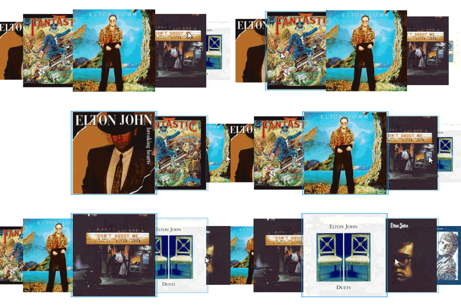
These are everyday actions using simple movement and are shining examples of when functional animation can make a world of difference.
SO…WHAT REALLY IS THE DIFFERENCE BETWEEN TRADITIONAL AND FUNCTIONAL ANIMATION?
To understand “functional animation,” we first must step back and understand a few key points in animation history.
Animation in its simplest form is the technique of capturing successive imagery to create the illusion of movement when shown back as a sequence. In its earliest form, these sequential images could be seen on the side of vases and pottery.
One such bowl discovered in Iran’s Burnt City dates at over 5200 years old and features a goat leaping up to snatch leaves from a tree. As the viewer spun the painted pot around on its base, the action of the goat could be seen in such a way as to convey the entirety of the desired narrative.1 Eventually pots and murals gave way to manuscript. The codex Sigenot from medieval Germany (circa 1470) is one such example of early sequential animation on manuscript.2 It tells the heroic epic of Dietrich von Bern in poem, featuring detailed sequential illustration with relatively short time frames between phases of action. Manuscript was eventually replaced by spinning discs and flip books of various formats (the phénakisticope3 in 1833, the zoetrope4 in 1866, and the kineograph5 flip book in 1868) until eventually giving way to “traditional animation” and the use of film in the late 1800s to early 1900s.

“Traditional Animation” is defined as the technique of drawing each step in an action or series of actions onto a physical medium so that, when viewed sequentially, that action has the appearance of real movement. While the flip books, spinning discs, and pottery that came before film technically count within this technique, today’s understanding of the term has repurposed the label “traditional animation” to mean sequential illustrations drawn by hand and printed onto film cells. The early animated narratives produced by studios like Disney and Warner Brothers, fall into this category. Pixar (founded in 1986), and later DreamWorks (1994), would take this concept into the digital realm, forgoing the traditional step of hand illustrating each frame using 3D software modeling and animation tools.
The most important distinction to make here is one of intent. Up until this point, animation served one purpose: to entertain, typically using a story-like narrative. But in June of 1987, everything changed.

When Steve Wilhite of Compuserve introduced the animated Graphics Interchange Format (or GIF) to the world, he opened the possibility for animation to be encapsulated into tiny, bit-sized actions6. Because the file format itself was geared toward the smallest, most compressed size possible, there was literally no room for long, complicated stories. Instead, these animated actions became repetitive functions. A spinning logo, for example. Or a bouncing ball. Or a twinkling star. And thus “functional animation” came to be.
IS ANIMATED GIF THE ONLY OPTION?
Other file formats have since come and gone, but the animated GIF continues to exist and serve a purpose. Macromedia’s Flash promised a hybrid approach to solving the delivery of longer linear narratives (welcome videos, tutorials, etc.) with functional animation (rotating knobs, sliding toggle switches, etc.) when it was released in 1996, but the combination of slow load times, plugin requirement issues, and specific required skill sets for designers eventually proved too much to contend with. Adobe’s 2005 purchase of Macromedia staved off Flash’s death for more than a decade, but Adobe has since said it will phase out the file format by 20207.
Currently Animated Portable Network Graphics (APNG), Multiple-image Network Graphics (MNG), Free Lossless Image Format (FLIFs), Google’s modern image format WebP6, and Scalable Vector Graphics (SVG) all exist as options beyond animated GIFs for the delivery of functional animation, along with alternative methods for animating static images using Java, JavaScript, Microsoft’s Silverlight.
IF I’M NOT TELLING A STORY WITH FUNCTIONAL ANIMATION, WHAT AM I SAYING WITH IT?
Functional animation is more akin to the period on a sentence, than the whole sentence itself. If we approach it in this way…as elements that punctuate a design to better imply intent…then we can design experiences that have better inherent cohesion and build trust between the user and the design.
In the same way that we use periods, exclamation points, question marks, and other punctuation, functional animation has its own set of usable components. These fall into three major categories: Calls to Attention, Results (from Actions), and Transitions (between States).
TYPES OF FUNCTIONAL ANIMATION: CALLS TO ATTENTION
In real life, we walk down streets and navigate through stores and, in normal circumstances, everything seems as it should. But when a sign needs to get your attention, or a sale wants to notice it, we receive visual cues like the flashing of a light or the chirping of an alert. These calls to attention are the sorts of actions that functional animation can help us achieve in the digital world.
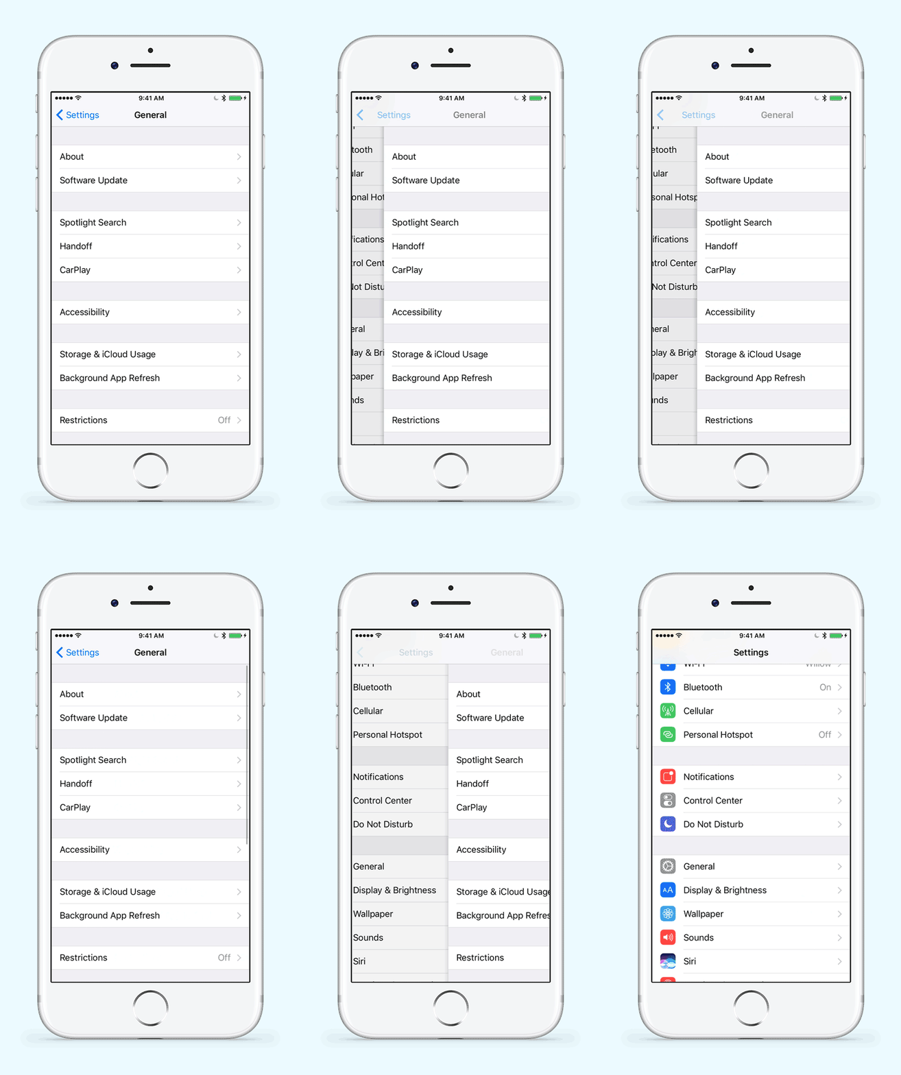
Alerting a user to the ability for an item on the page to move in a certain way allows the user to learn a desired functionality without having to explain it to them through tooltips and secondary information pages. For example, a drawer menu that hints at its functionality or slinks open for a fraction of a second before sliding out of the way when a user first views a homepage can teach that the main menu exists inside a sliding drawer.
Or a blinking or bouncing icon on top of a notepad or envelope can show a user that they have a new task or message.

Or perhaps an intro animation to an app can harken back to its real-world simulacrum to capitalize on a user’s prior experiences. All of these are great options for when to include functional animation but are certainly not the only examples. Building on your own experiences with the world around you offer the perfect opportunity to discover how your attention is being lobbied for and how you can bring those same functions to bear within a successful UX design.
TYPES OF FUNCTIONAL ANIMATION: RESULTS (FROM ACTIONS)
Like setting up an expectation for what will happen when a user enters an interface, showing the result of an action can be just as informative. The importance of having direct feedback from a user taking an action cannot be overstated. Resulting actions help define whether an action is at the beginning or end of their function and give a sense of completion once the user releases their contact with the screen.
Consider the action of pushing a button. With a static image, it is impossible to tell whether the state of the action is at its start, middle, or end. For a user, this could result in confusion and double-clicking to make sure their desired action is taking place. But when combined with functional animation, a button might show an initial state, its traditional hover state in a desktop environment, a depressed state, and a state of completion. Not only that, but when coupled with auditory cues like the sound of a click on press, or physical cues like the vibration of a device upon the successful switching of a state based on button release, the button becomes even more definitive in its action.

Other types of resulting actions often include the sliding of a toggle switch between multiple states, the successful sending of a message by way of an auditory cue like the whoosh of a paper, or physical buzz of a device upon receiving an incorrect password.

TYPES OF FUNCTIONAL ANIMATION: TRANSITIONS (BETWEEN STATES)
Finally, the use of functional animation via transitions between states can guide a user tastefully through a design while keeping the entire experience clean and cohesive. Little things like the sliding of a drawer menu that gracefully slides in when activated, a slight zoom into a secondary page to indicate its relationship to the parent page can help define spatial relationships between content for the user, or a progress bar to show the time a transition will take between states. The most important aspect of any transition is in whether the user understands where they started, where they ended up, and a sense of implied direction as to how they got there.
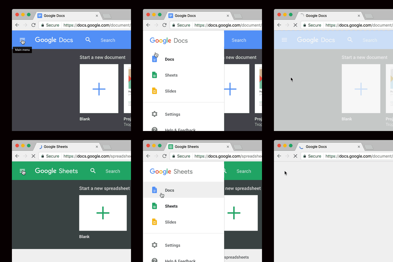

With transitional animation, as with any animation in general, it’s important to remember that hard transitions are typically jarring and leave a user unsure of how they got to where they ended up. The use of “easing in” and “easing out” in almost any situation allows for soft transitions, giving the user the feeling of a slight velocity increase in the middle of the action followed by a small decrease into the next state.
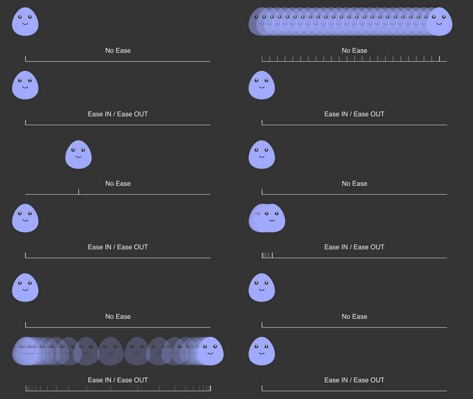
Perhaps this showcases the purpose of functional animation better than calls to attention or results from actions. The goal to create a comfortable, intuitive interface that asks very little of a user’s attention when teaching how to interact within it is the end goal for any functional animation. And transitions show intended action better than almost anything else.
WHAT SHOULD I KNOW BEFORE I MAKE MY OWN FUNCTIONAL ANIMATIONS?
In the world of functional animation and design, same as with consulting, developing, and testing, there are best practices. It is good to keep in mind a few solid standards of practice when creating your own animations.
- Don’t overdo it. Animation can quickly go too far, leaving the user behind to wonder whether they did something wrong. It is vitally important to keep all functional animations as simple as possible. Don’t bounce a notification alert more than once. Or, if you must bounce it a few times, make each subsequent bounce exponentially less to get it out of the way. Don’t create an opening animation that requires a skip button. Nobody will watch it and everyone will be frustrated with the fact that they have to take an action just to get into the app. The human brain fills in a great many gaps in perceived motion, meaning that it takes very little to imply an intended motion or action.
- File size, load time, and performance are key. If loading an animation even remotely slows down the load time for a site, consider its importance and weigh the value of its function against the time it will take a user to load the app every time they visit it. It won’t matter how useful the animation is if it makes the site so slow to load that a user thinks twice before visiting.
- Text will never be legible while it is in motion. If a piece of text must move, understand that it is little more than an illegible facsimile of itself until you make it land and sit still.
- Real-world pacing is important to making a user feel comfortable. The purpose of functional animation is to make the online world seem a little more real. Inappropriate motion, lake of easing in and out, and animation speed that is incongruous with what a user would expect based on real-world use will create disparate environment that clashes with your designed intent.
- Test, test, test. The person sitting in the office next to you. Your kids. Your best friend from high school. They all have different perceptions of what works and what doesn’t. But everybody is starting off with many of the same initial concepts of what it feels like to turn on a switch, close a door, or wait for water from a faucet to fill a jar. The more people you can test a functional animation on, the better a representation you will end up with as a final piece.
FUNCTIONAL ANIMATION, HERE I COME!
As we move more and more toward the blending of the real world and the digital, functional animation becomes not only desired but essential. Mobile app development is the most prominent landscape we must address for now, but the augmented reality (AR) landscape is not far behind. And where some aspects of mobile design might be able to get away with ignoring functional animation best practices here and there, they simply cannot in AR. Motion sickness and spatial representation will only become more prominent and more important as we move into the future. Thus, having a solid understanding of why functional animation exists can help us as designers to build upon it in ways that help users along, building trust between all parties and giving a sense of comfort along the way.
Functional animation is just one of many ways to improve user experience. Reach out to Magenic to find out how we can help your business create meaningful digital experiences for your customers.
References
- Iran’s Burnt City Pottery
- Sigenot Animation
- Phenakistiscopes
- Zoetropes
- Kineograph Flip Books
- The History of Animated GIF
- The Death of Flash
Tools and Resources
—
